What's Wrong With This Photo? [1/10/19]
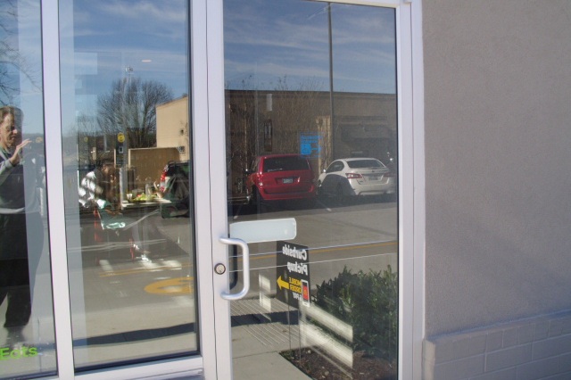
Look at the photo below. What you are seeing is an exterior entry/exit door at a recently renovated quick service restaurant. What’s wrong? HINT: Can you see the little sign on the door, right there above the reflection of the red and white vehicles? No? That’s the point!
From a distance, and even up close in the photo below, it is hard to see what that sign is saying. In case you still cannot see it, it says “Accessible Entrance”, and points to the right. And not too far to the right at this facility is an ADA accessible entry/exit door. The door this sign is installed on is not ADA accessible.
2010 ADA Standards for Accessible Design, Standard 216.6, Entrances, states, “Directional signs complying with [Standard] 703.5 that indicate the location of the nearest entrance complying with [Standard] 404 shall be provided at entrances that do not comply with [Standard] 404.“ Standard 703.5.1, Visual Characters, Finish and Contrast, states, “Characters and their background shall have a non-glare finish. Characters shall contrast with their background with either light characters on a dark background or dark characters on a light background.” So this sign comes up short in several ways. There is glare, and there is not a contrasting background. All this makes the sign difficult to see from a distance and to some extent up close. A representation of a proper sign is shown below.
ADA Sign with Contrasting Letters and Background


